
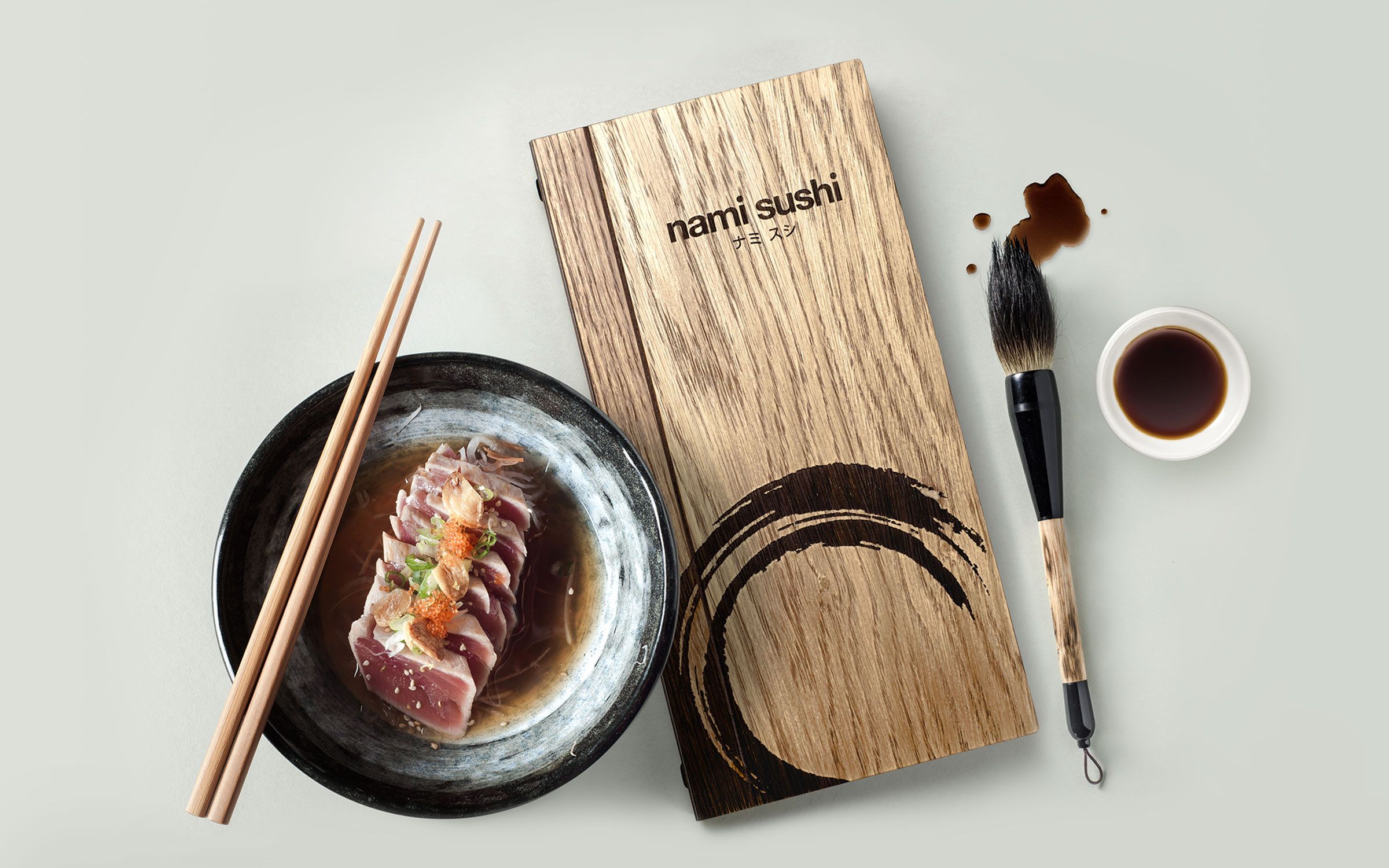


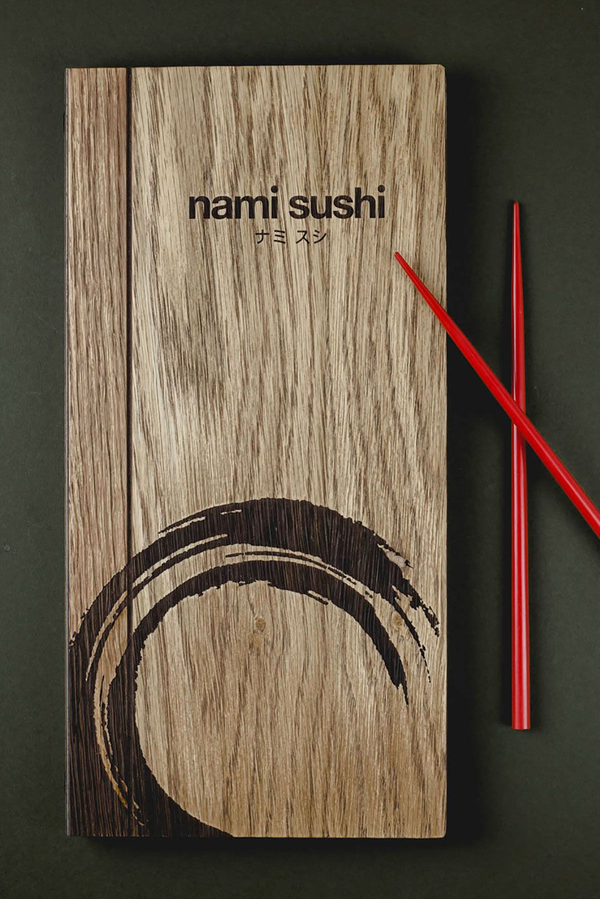


'Nami' means wave and the brief here was to explore a calming, natural and traditional approach to a sushi bar brand.
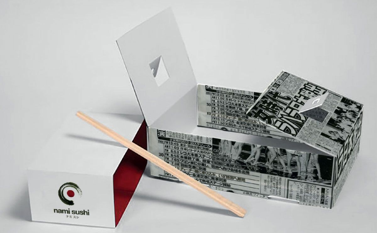
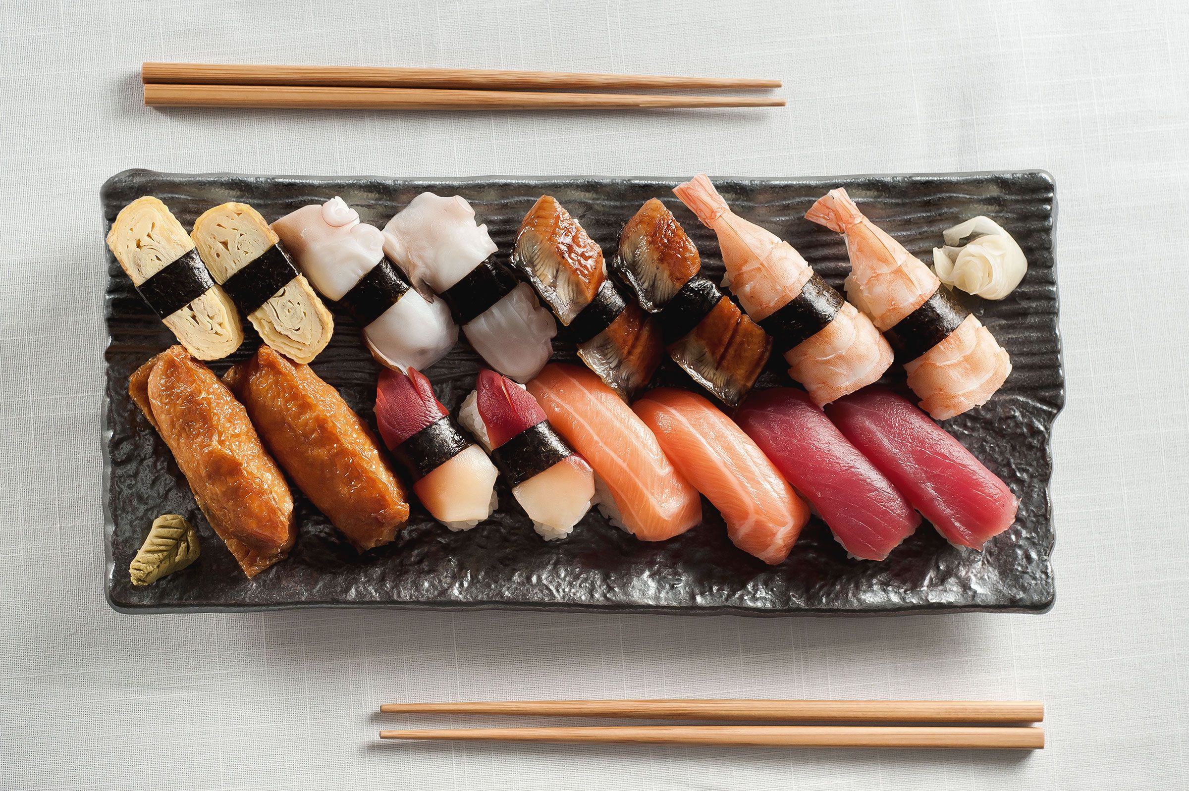
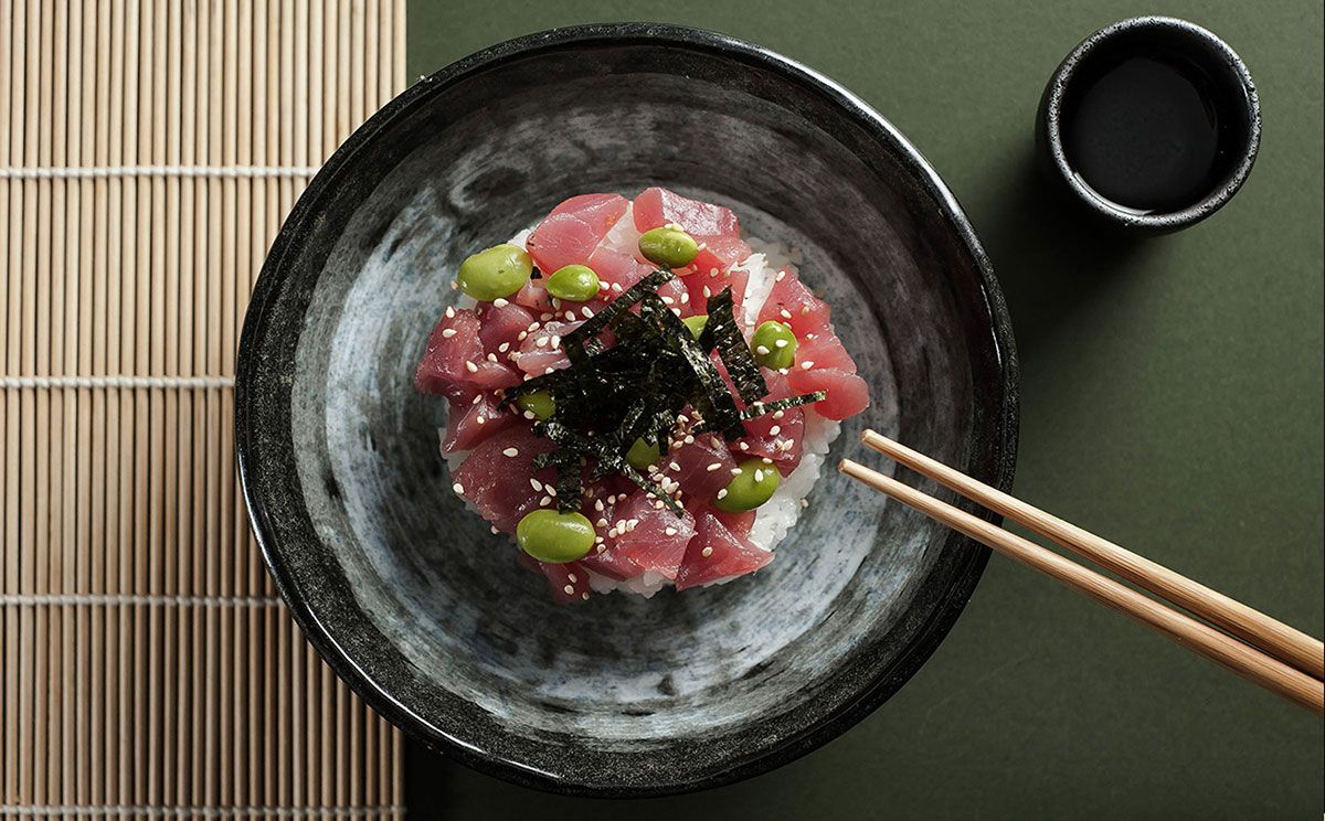
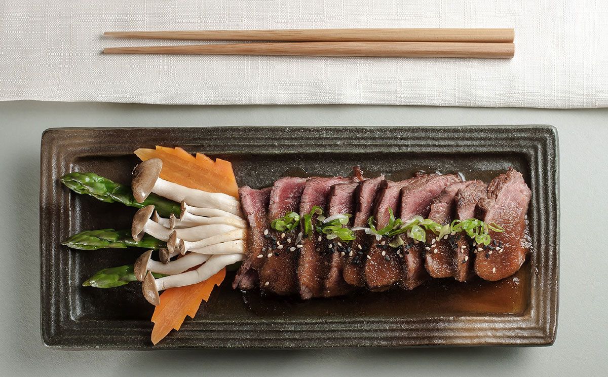
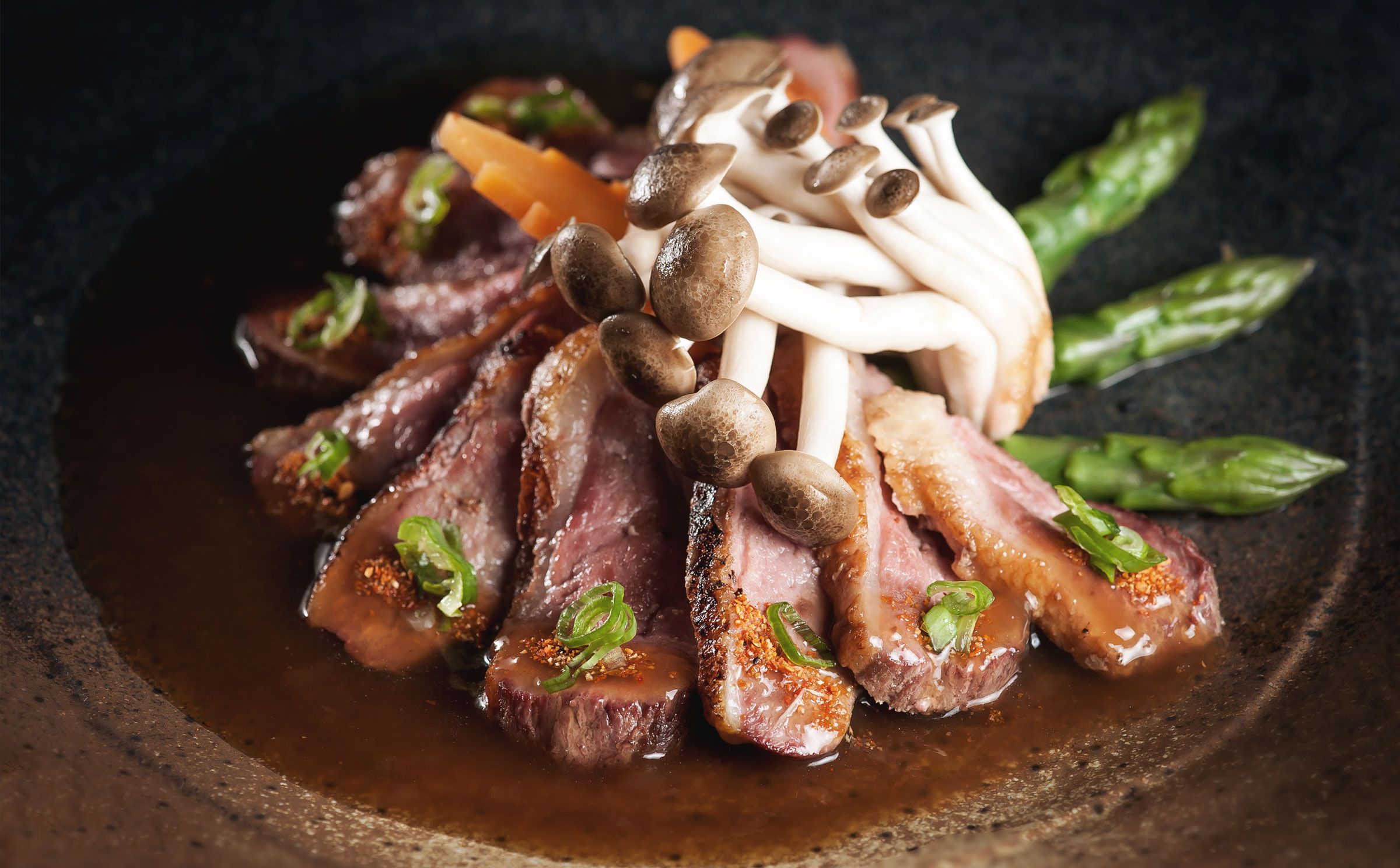
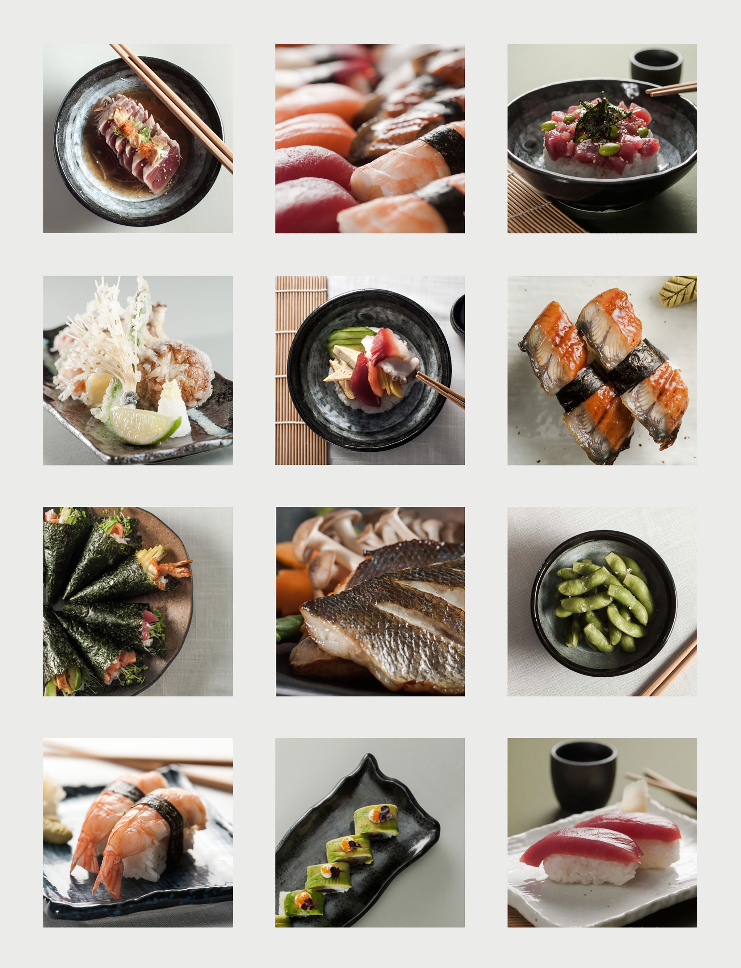
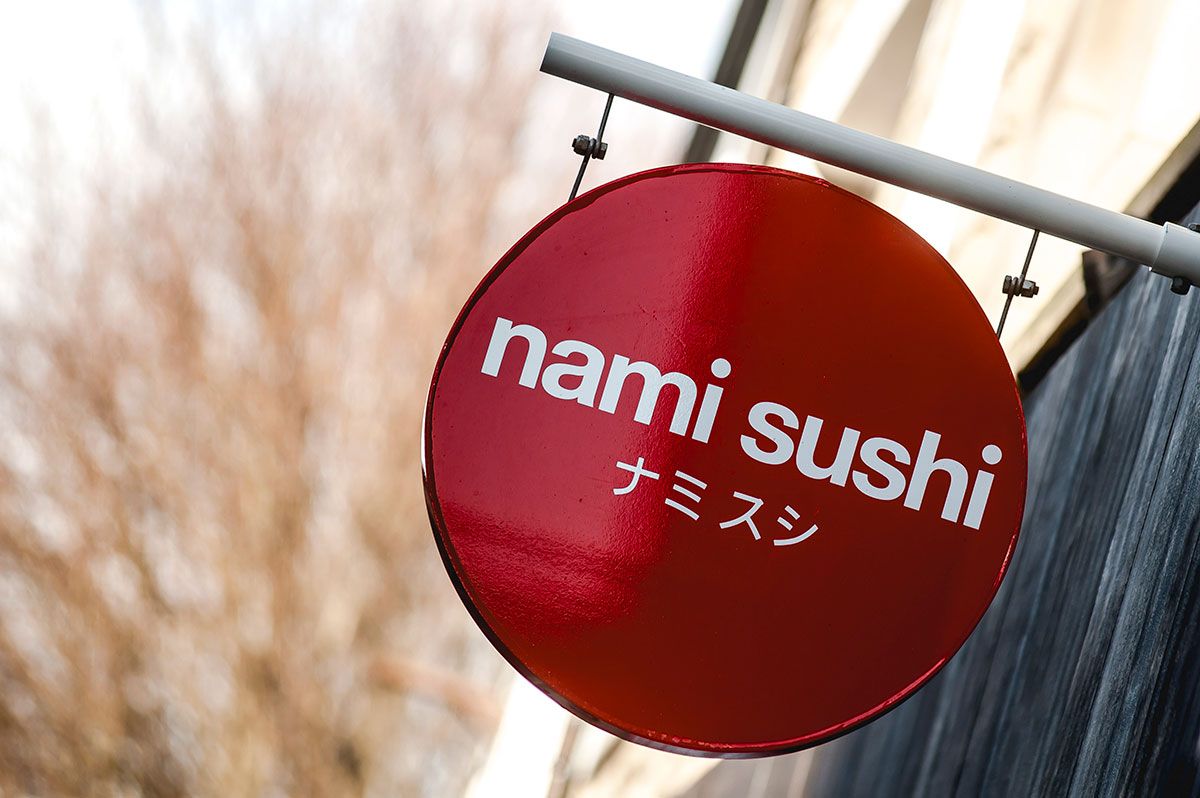
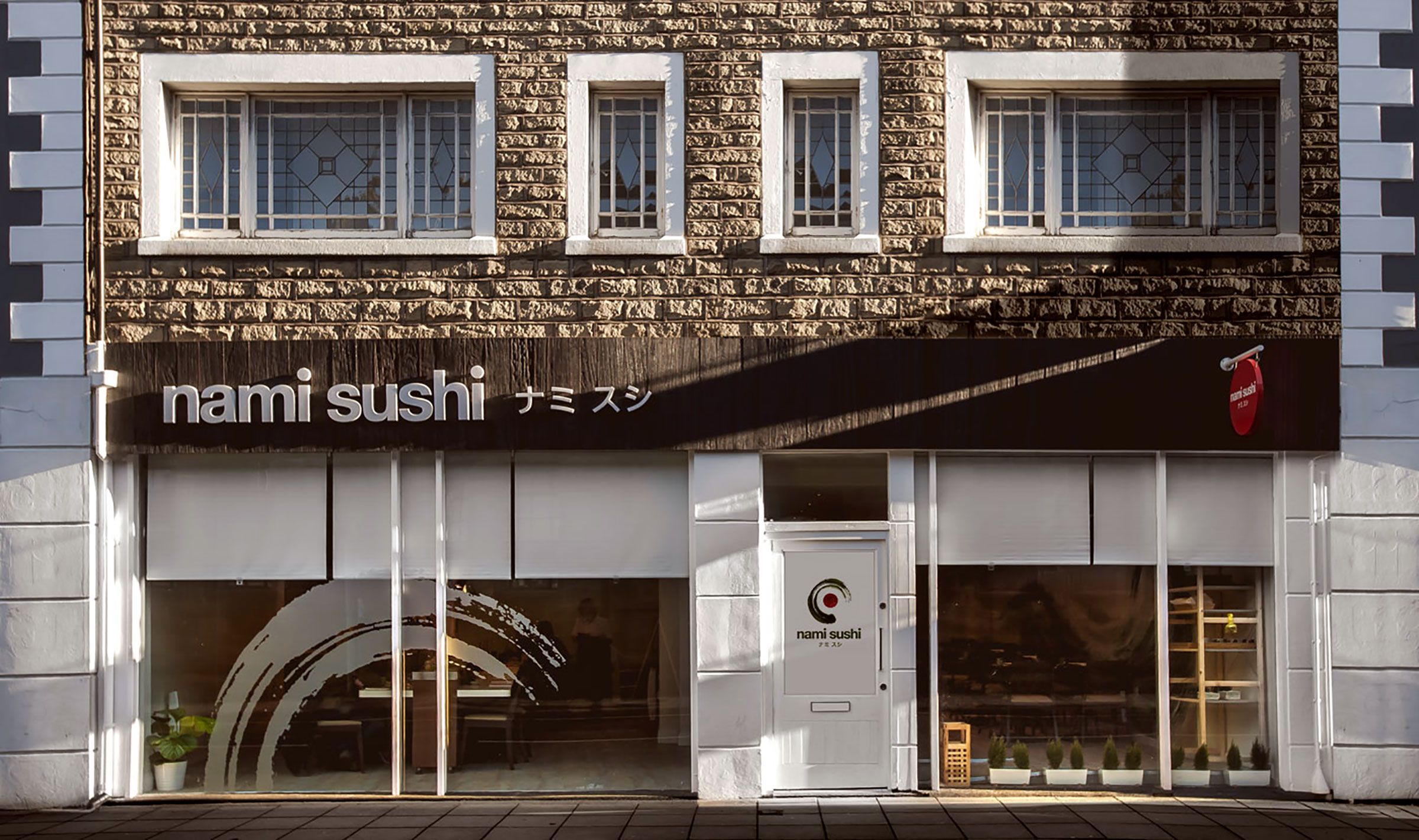
The Nami logo uses an 'enso' or 'zen circle' painted with a Japanese brush in a dark nori (seaweed) green. A red centre is included to represent the Japanese flag and together this looks like 'Norimaki' (a typical sushi dish). The 'enso' is also used as an additional graphic for the brand and cropped to appear like a wave. Food at Nami Sushi uses the best ingredients sourced from local suppliers in and around the British city of Lancaster. Being a place proud of its quality local produce, the strapline 'A local taste of Japan' was developed to reinforce the brand. This concept is explored further in takeaway packaging made using Japanese newspaper as a tribute to the age old British fish and chip shop packaging of the past. The landscape used for the poster is mount Fuji in Japan with Ashton Memorial in Lancaster.