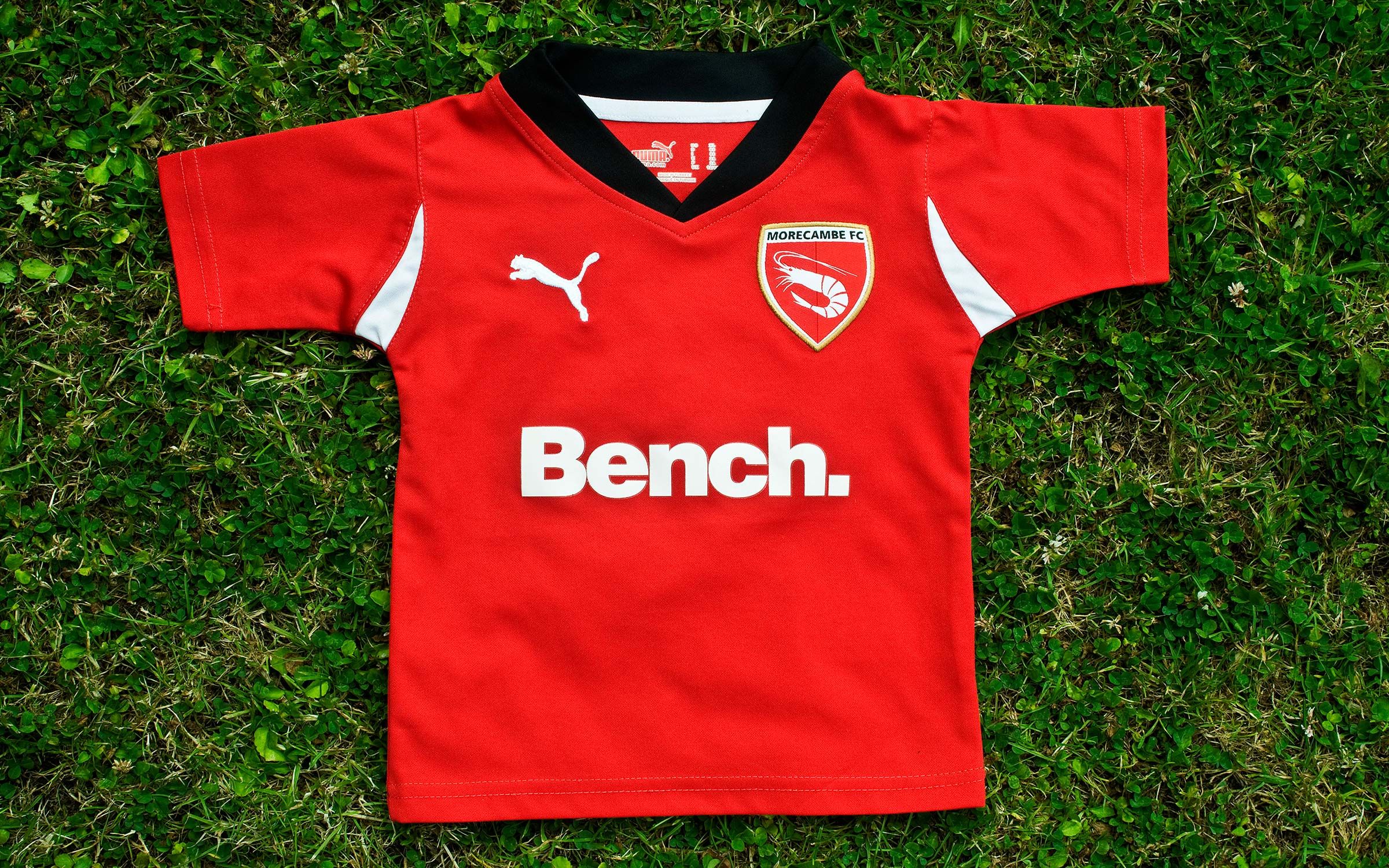
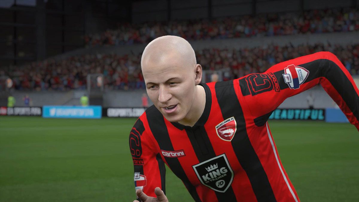
The task for Morecambe FC was to create a simple yet striking modern club crest using the frutiger or humanist 777 typeface and a shrimp. The club's previous traditional town crest could no longer be used for copyright reasons.
A shrimp had been used in the 1960s, early 1970s and again in the 1980s as a bold statement on the club's nickname ‘the Shrimps’. So while at first the new design seemed like a departure from the club's history, it is actually a tribute to the badges of the past and the decision to explore a shrimp once again as an option was a request by both the club and the fans.
A number of designs were presented and in the end Peter McGuigan, the Morecambe FC chairman along with the club's directors decided on this crest designed and illustrated by myself. Never before has something I have done come under so much scrutiny and I am immensely proud to be supporting our local team having designed this crest.
